Pxless: Scalable and Future-Ready Digital Interface Design
1. Introduction: Why Digital Design Needs a New Foundation
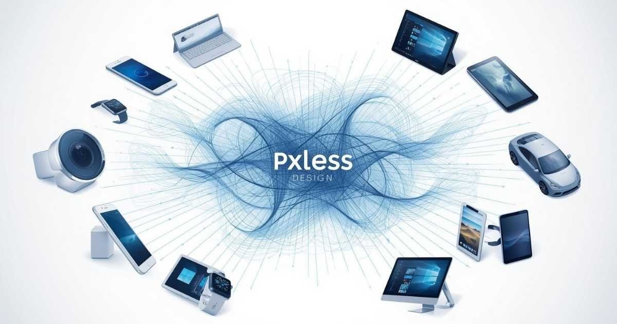
Digital interfaces no longer exist in controlled environments. A single product today may be accessed on a compact smartphone, a foldable device, a high-resolution desktop monitor, a smartwatch, or even an in-car display. Each of these platforms introduces unique constraints related to size, density, interaction method, and user expectations.
Traditional design approaches, heavily dependent on fixed pixel measurements, were never built for this level of diversity. While pixels once offered precision, they now introduce rigidity. Interfaces designed with static measurements often struggle to scale, adapt, or remain accessible in modern contexts.
Pxless design emerges as a response to this reality. It represents a shift away from rigid control toward intelligent adaptability. Instead of designing for screens, Pxless focuses on designing for behavior, context, and experience—making it a foundational approach for modern and future digital systems.
Stay on top—our expert-selected content is your guide to success.
2. Pxless Design as a Design Philosophy, Not a Technique
Pxless is often misunderstood as merely avoiding pixels. In reality, it is a design philosophy centered on flexibility, proportionality, and contextual responsiveness. Pixels may still exist, but they no longer dictate the structure of the interface.
In a Pxless mindset, layouts are defined by relationships, not numbers. Components respond to their environment. Typography adapts to both device and user needs. Interfaces remain functional under extreme scaling.
Pxless encourages designers and developers to think in systems rather than isolated screens. This system-driven thinking aligns naturally with modern component-based development and scalable design systems.
3. The Core Problem with Pixel-Driven Thinking
Pixel-driven design assumes predictability. It assumes that screen dimensions, resolution, and user behavior remain stable. Modern technology has proven otherwise.
Pixel-centric systems often fail when users increase text size for readability, content expands due to localization or dynamic data, screens change orientation or aspect ratio, and new device categories enter the market.
These failures are not accidental; they are structural. Pxless design removes this fragility by replacing fixed constraints with adaptive logic.
4. Pxless vs Pixel-Based Design: Conceptual Difference
| Perspective | Pixel-Based Design | Pxless Design |
|---|---|---|
| Design Focus | Visual precision | Behavioral adaptability |
| Layout Nature | Static | Fluid |
| User Control | Limited | Respected |
| Accessibility | Add-on | Built-in |
| Scalability | Fragile | Resilient |
| Future Growth | Restricted | Flexible |
5. Foundational Principles That Power Pxless Design
5.1 Behavior-First Layouts
Instead of asking how large an element should be, Pxless asks how it should behave when space changes. Layouts stretch, compress, and reorganize naturally without breaking hierarchy.
5.2 Proportional Typography Systems
Typography becomes a living system rather than fixed sizes. Text adapts to screen dimensions and user preferences while preserving visual balance and readability.
5.3 Contextual Component Intelligence
Components understand their surroundings. Their spacing, size, and alignment change depending on available space, content density, and interaction requirements.
5.4 Accessibility as a Structural Feature
Pxless design inherently supports accessibility. User-defined zoom levels, font scaling, and system preferences do not disrupt layout integrity.
5.5 Consistency Through Systems, Not Screens
Instead of designing multiple layouts for different devices, Pxless builds a single flexible system that behaves consistently everywhere.
6. Measurement Logic in Pxless Systems
| Concept | Purpose | Impact |
|---|---|---|
| Proportional sizing | Flexible scaling | Stable layouts |
| Viewport awareness | Screen responsiveness | Device adaptability |
| Contextual scaling | Local intelligence | Component resilience |
| Root-based hierarchy | Global consistency | Typographic balance |
| Content-driven sizing | Dynamic behavior | Better UX |
7. Why Pxless Improves Long-Term Product Quality
Pxless systems adjust smoothly across all sizes instead of jumping between rigid breakpoints. Interfaces remain usable for users with diverse needs without requiring separate accessibility versions.
Flexible systems eliminate constant layout fixes caused by new devices or content changes. Cleaner layout logic improves rendering efficiency and reduces unnecessary complexity.
Pxless prepares products for future technologies without repeated redesign cycles.
8. Pxless Design Across Modern Digital Environments
8.1 Web Platforms
Pxless allows web interfaces to scale naturally across desktops, tablets, and mobile devices while maintaining usability and clarity.
8.2 Mobile Applications
Mobile products benefit from reduced fragmentation, as a single flexible system adapts across screen sizes and orientations.
8.3 Emerging Interfaces
Wearables, automotive displays, IoT devices, and immersive environments demand adaptability, making Pxless especially valuable in these contexts.
9. Human-Centered Impact of Pxless Design
Pxless design prioritizes human behavior over device limitations. Users are not forced to adapt to rigid layouts; instead, interfaces adapt to users. Content remains readable, interactions remain comfortable, and navigation remains intuitive regardless of context.
This adaptability leads to higher engagement, improved trust and usability, lower frustration rates, and greater inclusivity.
10. Practical Challenges and Strategic Adoption
Adopting Pxless requires a shift from pixel-perfect thinking to system-level design. Teams must invest in planning, testing, and consistency. However, once established, Pxless dramatically reduces long-term complexity and maintenance effort.
The initial learning curve is outweighed by long-term stability and scalability.
11. Conclusion
Pxless design represents a mature evolution in digital interface development. By moving beyond rigid pixel constraints, it enables scalable, accessible, and future-ready experiences. In an environment defined by constant technological change, Pxless offers a stable yet flexible foundation for sustainable digital products.
Rather than being a temporary trend, Pxless is a strategic design philosophy that aligns digital experiences with the realities of modern and future interaction.
FAQs
What is the core idea behind Pxless design?
To create interfaces that adapt intelligently to different devices, users, and contexts.
Does Pxless completely eliminate pixels?
No. Pixels may still be used selectively, but they no longer define the system.
Is Pxless suitable for large-scale applications?
Yes. It is especially effective for complex, multi-platform products.
How does Pxless support accessibility?
By allowing layouts and typography to scale naturally with user preferences.
Is Pxless future-proof?
Yes. Its adaptability makes it ideal for emerging devices and technologies.
Expand your mind—read the top articles handpicked just for you.